On an average, I take about 30 minutes to finalize an Instagram post. I even have apps on the side that help me time my post, see if it fits into a grid, and use the right tags. Social media is all about curation, and curation takes effort - nobody knows that better than the 35 wrongly edited remnants of the final picture buried in my gallery.
What is all this effort for? More importantly, for who?
In this series, called Unediting, artists from all over the world reveal to us what really goes on behind the scenes of their finalized art.
For this post, we decipher a photo series by Janhavi Sharma.
Janhavi Sharma is a self-taught visual artist with a background in Journalism, and Modern and Contemporary Indian Art Theory. Her primary research interests lie in Intersectional Feminism, Migration, Memory and Identity. When she’s not painting, which is her preferred medium of expression, she is found staring at leaves for long hours and discovering translated poetry by unknown writers to fuel her daydreams.
About the Series
Chokher Bali*, a fashion photo series I recently did for a clothing brand called ‘Chowringhee Bazaar’, was my first fashion shoot ever. Although I’ve been experimenting with photography for quite sometime now, I never really got myself to do a series, or work commercially at all before this. So when this project came along, getting a conceptual clarity was the first thing I did.*
By using Tagore’s story, Chokher Bali as a reference, I could then imagine enough compositions to play with, emotions of loneliness, sisterhood, and eventual defiance could be drawn from the story itself. I saw this photo series as an extension of my artwork, drawing the photograph in my head as I would if I were to illustrate it. That helped organising my vision, which was necessary to do since I was also a bit nervous about it being my first shoot.
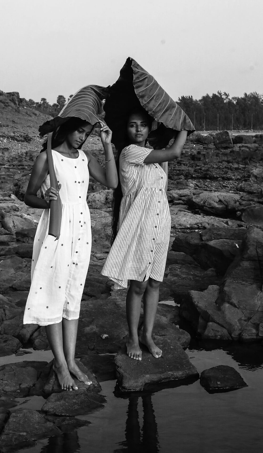
The garments that I had to shoot were all khadis, pastels and white. I wanted clean and plain frames, so the focus remains on the models and their chemistry. I imagined natural props for ornamentation, big Taro leaves as metaphors for ghunghat to go along with the dresses as a modern interpretation of the story, Gypsophila flowers as see-through veils, and mogra garlands.
Equipment :
I used a Canon 5D with 35 mm, and 18-50 mm lens to shoot it with. No external lights, only reflectors.
Let’s take a look at photos that made the final cut for the client. Then we have Janhavi pick out a few of her personal favourites.
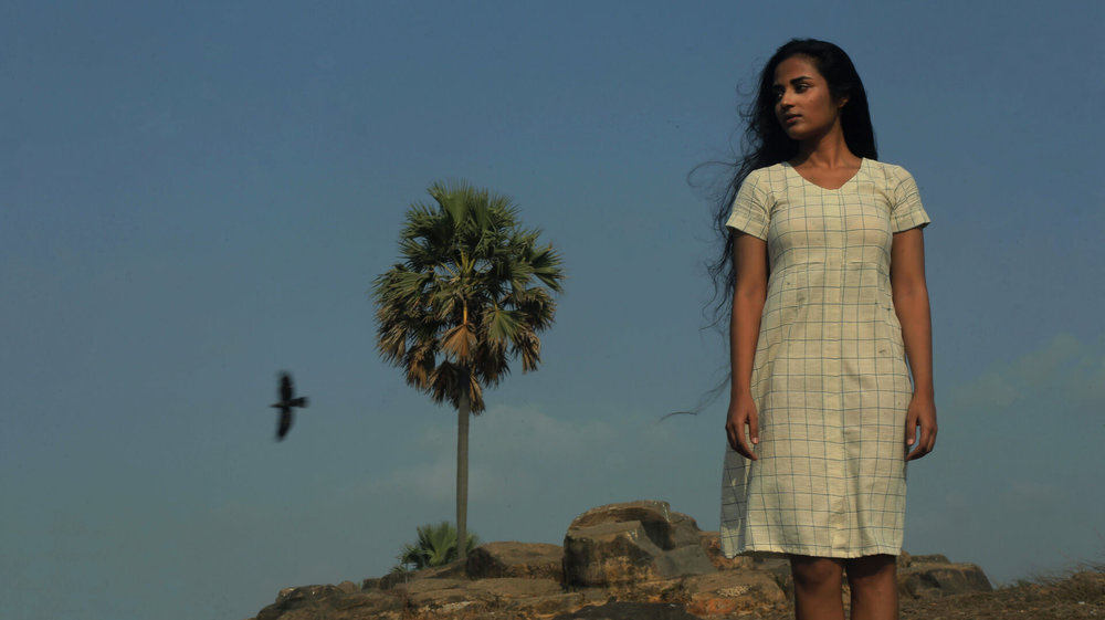
Sam Abell, acclaimed National Geographic photographer, explains his concept of composing photographs as a “back to the front” method, where you have objects of interest move from the background, to the middle ground, to the foreground. This makes our eyes travel more through the picture, from the girl in the front, back to the bird and the tree in the background.
You also need something to bring harmony to the whole image, something that ties everything together. Colour palette and tones are one way to do this, I will talk about this more further below. Another way is to minimise the number of “directions” in the image. The direction of the flight of the bird and the girl’s eyes - same horizontal direction; and the vertical downwards direction of the girl, the tree and also the bird helps bring harmony to the image. There are no extraneous weird directions (which sometimes happen like someone’s arm being in a different posture).
Note: If, however, say you wanted to add some tension to the image, a conflict, you could have the bird and the trees flowing in the opposite direction to the girl’s stare. There’s no need for harmony in directions then, throw in a little chaos.

Notice how both the above images play with colour in different ways - while the one on the left focuses on more muted tones, with the colours being overall of the same tonality, the one on the right has more contrasting colours. The first then has a more calming and peaceful look to it, which also reflects in the pose and facial expressions, while the second pulls you in, especially with its pops of red.
The pose, the colours, all of it has to be in sync with each other for the image to work. The second image, with the colour tones of the first, would not be as effective. (snark alert: Something to remember next time you ask someone what Lightroom preset they used, without understanding why they used it.)
However, looking at just the final images tell only half the story. Let’s see the images which didn’t make the cut, and why.

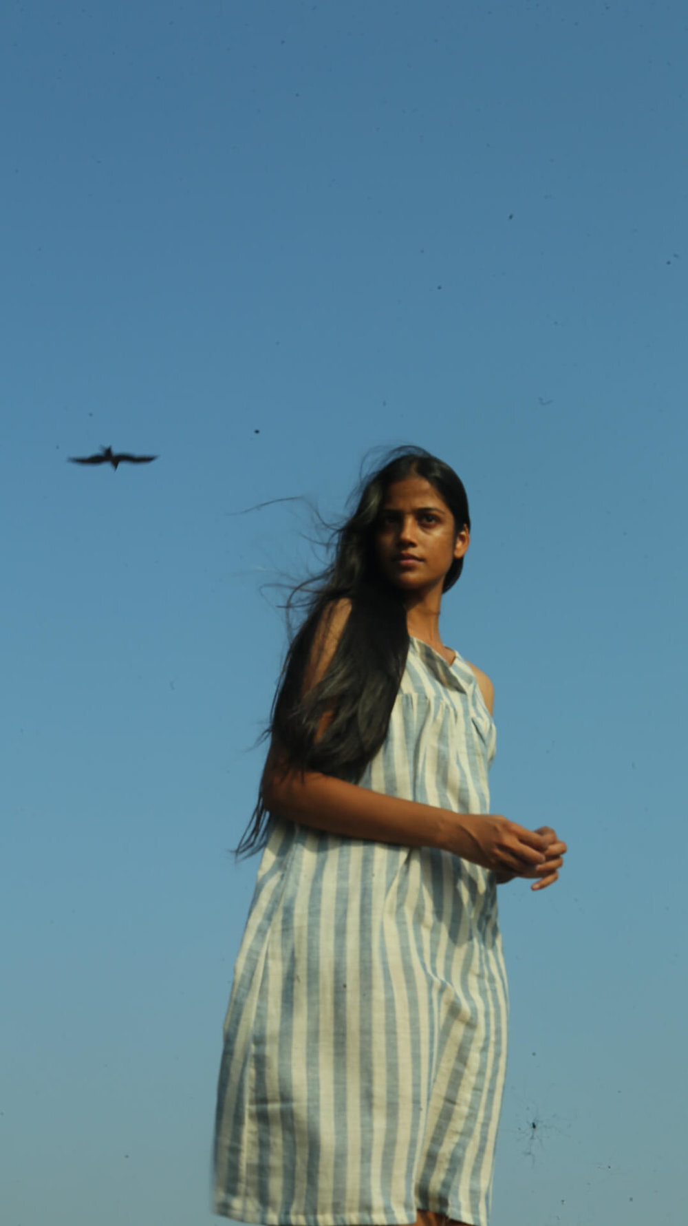
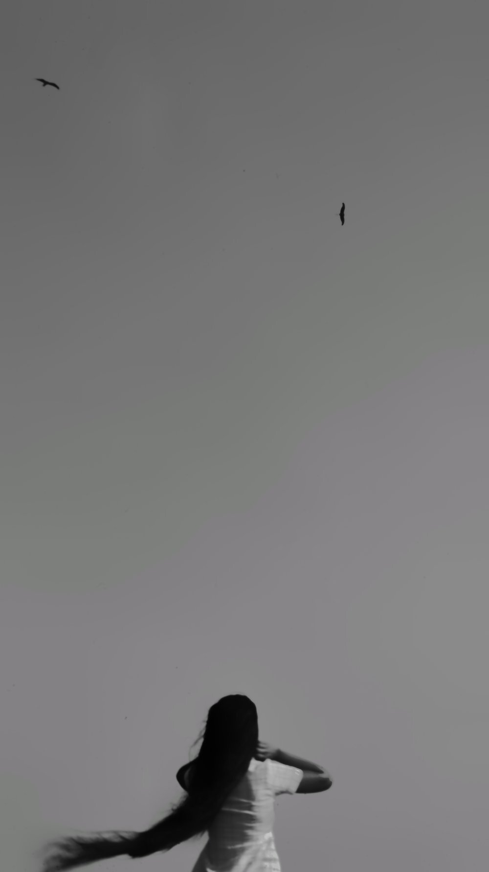
Janhavi*: I had captured both my models individually with the bird, and had planned on using them together in a triptych. But I felt the image I chose, fell completely in one axis. Her gaze, and the flight of the bird, so beautifully in sync. I felt it was very powerful individually, and decided to not use the other one at all.*

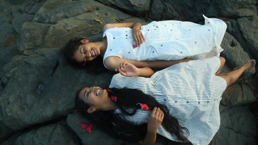
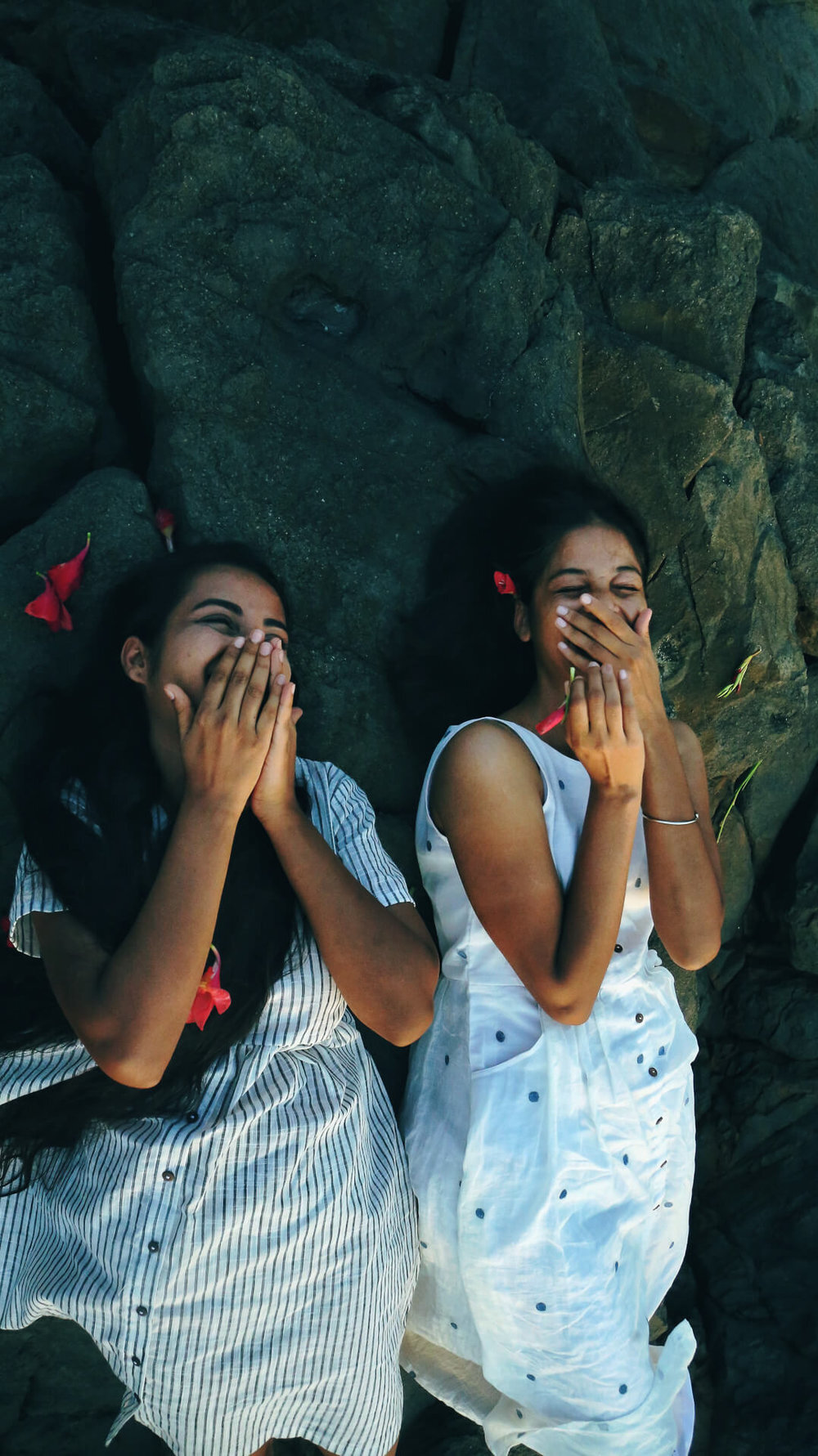
Janhavi*: Both images are of laughter, but there’s something very real about women covering up their faces as they laugh. It’s all about emotion and the moment between these pictures, and I chose the latter, for I felt it’s more familiar to the Chokher Bali theme.*

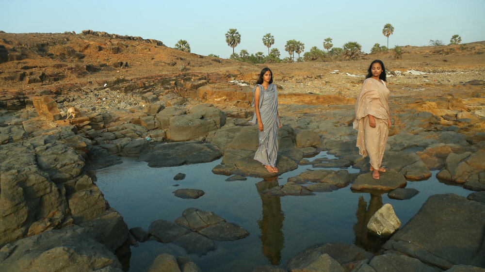
Janhavi*: Even though I liked the expanse and distance between them in the second one, I felt the first image was more powerful, with both of them looking at the camera and their reflection in the water very neatly composed with the trees in the background. For me, this image highlights perpetuating support, and stability in friendships.*
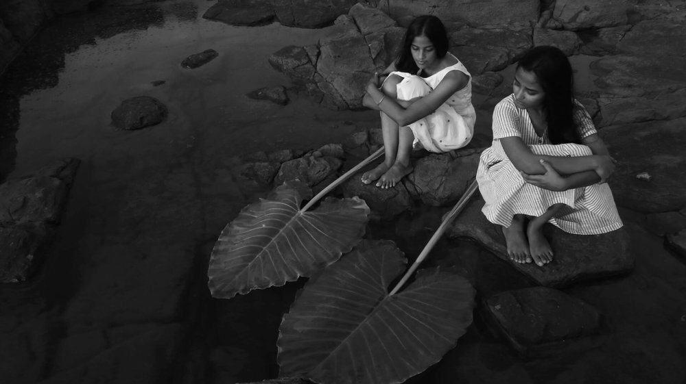
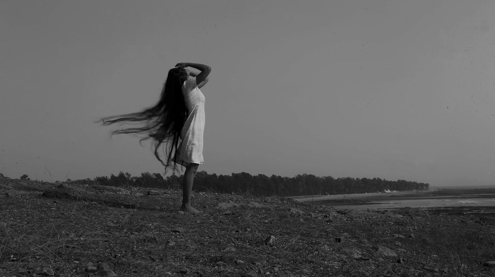
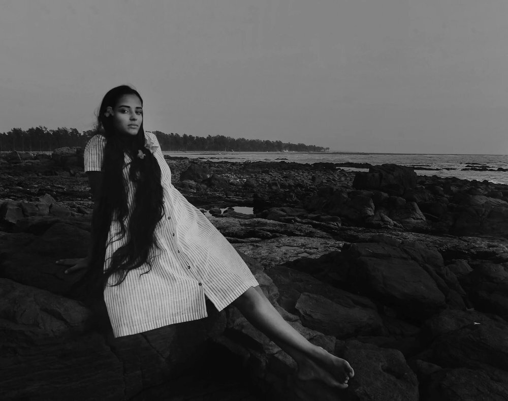
Janhavi*: I prefer black and white images for the story, even though this was a fashion shoot and I required to have the colourful ones edited for the client. But I felt I could highlight the metaphors I wanted to play with more, without colour. Where the leaf, is just about its shape and not about its green. Where the saree, is just about its drape and its fall, and not about the colour.*
I love black and white. Period.
Personally, black and white images from this shoot are my favourite!
Colour is a powerful tool to use while storytelling. However, without colour, the viewer is forced to look at other parts of the image. Which means, as photographers, we need to make sure there’s more details in the image, more tools to tell our story, to hold the viewer’s gaze.
Shapes, texture, light and shadow are few of the things that get highlighted in a black and white image. If as a photographer, you want the viewer to notice these details, processing an image as black and white is a good way to go about it. This also means that any unintentional details, like the texture of some prop, would also get highlighted, so be careful!
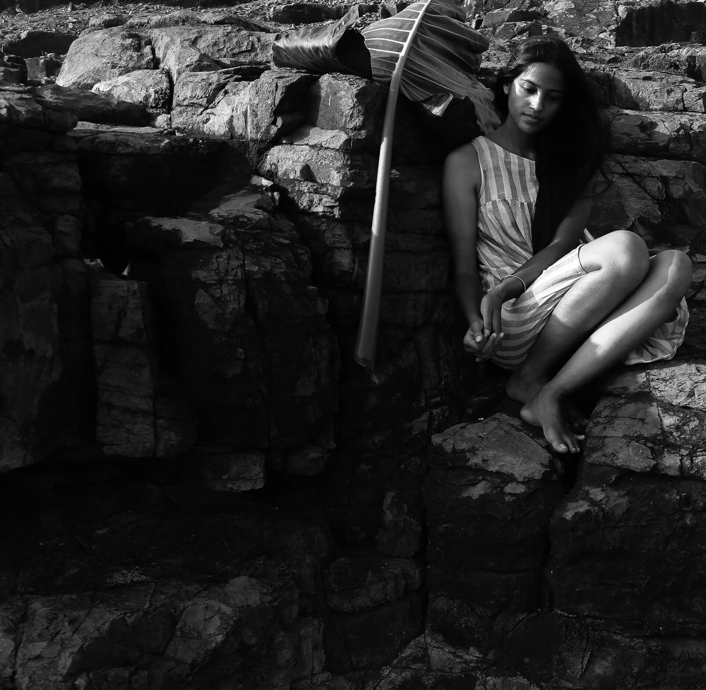
Janhavi*: The enigma of a modern-day interpretation of Chokher Bali, the relationships and conflicts in relationships that I wanted to explore worked more for me in black and whites, light and shadows. The giving away of ghunghats, and the obligations that come with them like one lets go of deceased, floating them away with a slight push, in the water, is the thought I tried to recreate with one of my images. I didn’t want colour to distract the emotion of the story, as colours often do bring with them a certain expectation, sometimes judgement, most times flavour. I struggle with colour for my paintings too, it’s so much beyond combinations and palettes for me, it’s about eliminating unnecessary chaos and minimalising meaning.*
Although, to be very honest, I am quite happy with the coloured versions as well. The pastels and whites worked beautifully with mud rocks, blue skies and greens.


You can find more of Janhavi’s work on her Instagram.
